See you at home.
How often do we say this in our daily lives? Sometimes affectionately, sometimes sternly, and sometimes absent-mindedly, out of habit, our thoughts already elsewhere.
In this two-part tale, we’ll be peeking into the home lives of six different people to reflect on the role of light in different spaces, and on its functional, decorative and emotive uses.
Finally home

George opens his front door and steps into his new living room, looking around with satisfaction. His little apartment has everything he ever wanted and, come to think of it, it doesn’t even look that small. He smiles as he thinks that lighting the walls was a really good idea.
Anyone who is getting ready to buy or furnish a house will find themselves considering the size of the rooms, particularly if they are on the small side. To make the spaces bigger, or at least appear that way, people usually choose to paint the walls in light colours.
Light can also be used to expand spaces with indirect lighting on the walls, as can be seen in this rendering.

Direct light from recessed ceiling fixtures
Courtesy: John Luttropp, Butterfly One-Story home, Sketchup

Direct light from recessed ceiling fixtures and indirect light from wall-mounted fixtures help to make a space seem bigger
Courtesy: John Luttropp, Butterfly One-Story home, Sketchup
One living room, many uses

Olivia closes her eyes and sighs contentedly: finally a quiet evening in!
She has already decided where she’ll be spending it. On her sofa in the living room. Now she just has to decide how. Should she go back to that book she started a while ago, binge watch a TV series or practise some yoga? Whatever her choice, lighting will create the perfect setting.
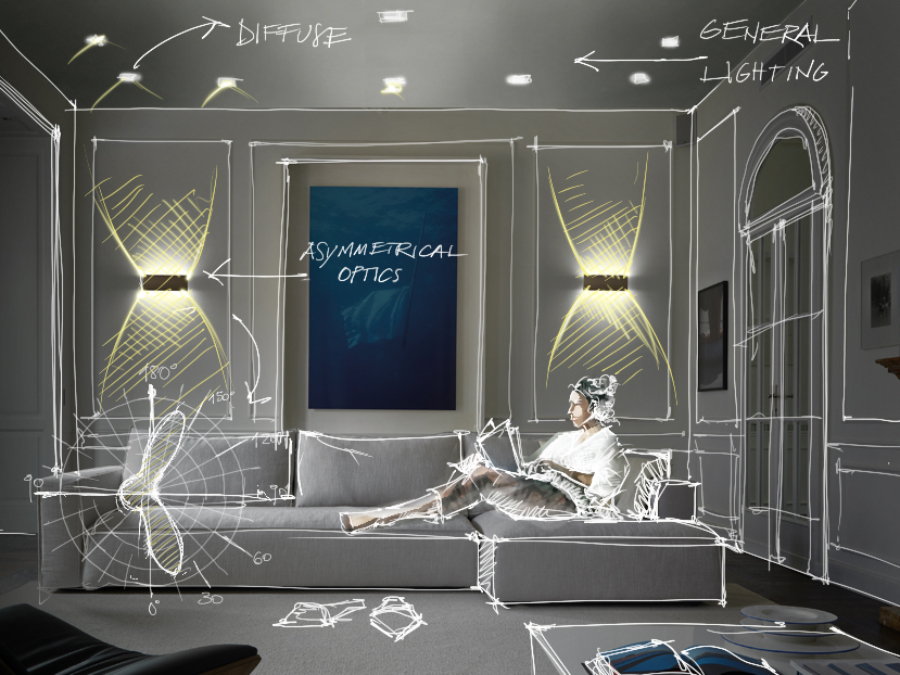
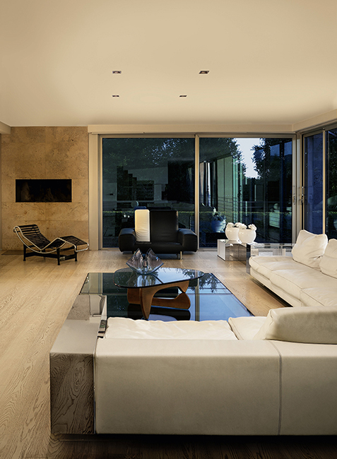
For ambient lighting in the living room, downlights or linear profiles in the ceiling with diffuse or wide optics will produce a soft, welcoming light.
If there is no dedicated task lighting, in the form of reading lamps or floor lamps, dimmable fixtures can add convenience: the light intensity can be adjusted to suit the time of day and the task at hand.
According to standard UNI/TS 11826:20211, the required illuminance level for reading is 300 lux. However, if, in the same space, you are engaged in an activity that is not classified as a visual task, the light level can be kept at around 100 lux, a threshold suitable for activities such as conversation.
Olivia can set the brightness to maximum (100%) to read a book, halve it for yoga (50%) and will probably prefer to reduce it to minimum (10%) when watching her favourite TV programme.
Turis 3.2, 3000K, 15W, white Find out more about the product

Brenta 1, 3000K, 19W/m, diffuse optics, installation flush with ceiling Find out more about the product
📱 💡 📱
Dimming, switching on and off at set times, and preset scenes for every occasion: with the Casambi app, you can manage L&L lighting fixtures from your smartphone’s touchscreen. Find the app here
As an alternative to adjusting the intensity of the downlights to a minimum, Olivia could also use single-beam wall-mounted fixtures: light directed upwards will illuminate the room indirectly and more subtly.
If, on the other hand, the wall fixtures are the main lighting in a room, the double-beam version is a better choice.
Whether the beam is single or double, asymmetrical optics push the light forward with greater intensity.
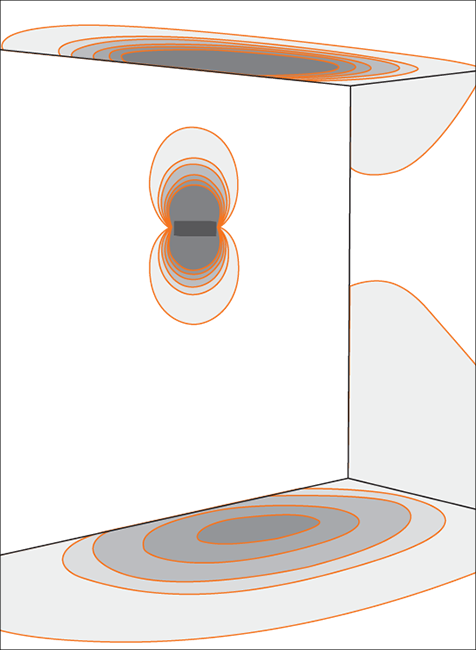
Berica IN 3.1, asymmetrical Find out more about the product

Berica IN 3.1, 3000K, 27W, asymmetrical, matt aluminium grey Find out more about the product
The use of wall-mounted fixtures is a good solution in rooms where installing a downlight would require considerable masonry work.
And, if the ceiling has exposed beams, wall lights offer the added advantage of allowing the wood to be emphasised.

Ella IN 2.0, 3000K, 13W, white Find out more about the product

Wall-mounted fixtures and furnishings
Olivia has switched off the recessed lights in the ceiling, leaving the living room to be lit only by the wall-mounted fixtures facing her. As she warms herself with an orange and cinnamon tea, her gaze wanders to the leaves of the tropical-themed wallpaper. The light makes it stand out, while the lamp itself disappears, covered as it is with the same paper.
Thanks to the versions with primer coatings, the lamps can be covered with wallpaper, as Olivia did, or they can be finished in the same paint as the wall, making the device disappear both in the day and at night.

🌈💡🌈
We have written an article about the primer coating: you can find it here!
If, instead, Olivia were to choose wall-mounted fixtures that complement the decor in the room, she could play around with the colour of the fixtures, choosing a chrome finish, for example, or RAL colours such as Pure Orange or Capri Blue. Or she could request a customized finish that blends nicely with the room’s palette and references some other element in the furnishings.

Ella IN 2.0, chrome Find out more about the product

Ella IN 2.0, capri blue / pure orange Find out more about the product
Light can also help to enhance a wall and, in particular, its texture: wall grazing optics can add value and bring out the texture of cast stone.

Neva 1.2, 2700K, 45W, 10°x40°, with honeycomb louvre, customized version CRI 90 Go to the project and credits

Tago 2.3, 2200K, 51W, 29° Find out more about the product
Most suited to this effect are recessed fixtures, but linear profiles on brackets installed close to the wall also work well.

Lighting for shelves
Olivia’s gaze moves from the wallpaper and travels around the room to the shelves that hold the many mementos she has collected over the years, including travel souvenirs (a little kitschy!), Polaroids from trips with friends, and art exhibition catalogues.
A living room often has shelves, bookcases and niches that house books and decorative pieces. Illuminating these elements requires small devices, such as recessed fixtures or mini projectors that can be installed in slim shelves and tight spaces and not distract the eye.
The items we store in these small corners tend to change with time, so diffuse or wide optics are a popular choice, as they can fill the whole space and illuminate any mix of objects.
However, Olivia chose an accent light that can pinpoint a particular article. In this case, a zoom lens is the ideal solution, because it lets you adjust the light output by narrowing or widening the beam.
The kitchen and dining room – recipes for light

Sam is excited: two old friends are coming for dinner tonight. The table is laid, the roast is in the oven, and he has prepared a corner on the peninsula for the aperitif that his guests will enjoy while he finishes cooking. The light from the suspended lamp falls on the snacks and wine glasses in a luminous circle. The effect on the glasses is enticing: he’s tempted to pour some wine for himself while he waits for his guests, late as usual.
The kitchen and dining room often share the same space, allowing the cook to socialise with guests. On the one hand, these two spaces form a single room, on the other, the activities that take place in them make them separate areas. Careful planning can meet this dual requirement: ambient lighting unites them, while task lighting creates hierarchies. Generally, the same colour temperature, a 3000K warm white, is used throughout the space, but with different lighting fixtures and outputs.
There are three main areas to be lit: the worktop – the actual kitchen – the dining area – the table where meals are eaten – and finally the general space, which incorporates the first two.
For the ambient lighting, the ideal solution is to use ceiling-mounted fixtures with wide or diffuse optics, capable of covering the whole area uniformly and giving continuity, in a similar way to the living room.
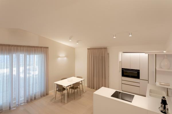
For minimum visual impact it is best to use standard recessed downlights, which offer a variety of aesthetic possibilities in terms of finish and shape. Alternatively, you can use ceiling-mounted fixtures, as in the apartment in the second photo, where they have been chosen for both the table and the kitchen area, visually knitting the two spaces together.
Moving to the work area, a good amount of light is needed here, around 500 lux, directed towards the worktop so that Sam can see what he’s doing while he prepares the meal. Sam could also choose recessed ceiling fixtures here, with narrower optics, preferably adjustable, so that the light output is concentrated in the areas that need it.
If there are wall units above the worktop, lighting is needed for the areas that the ceiling lights can’t reach. This is where lighting fixtures come in that are especially suited to this application, such as diffuse-light profiles with a fixed or tiltable body that can illuminate without the risk of dazzling the cook at work.

Light suspended above the peninsula
Sam’s friends are enjoying their aperitifs, as evidenced by the way the plate of appetisers was quickly emptied! The peninsula was the perfect choice, thinks Sam as he switches off the oven – this is where he has breakfast every morning.
By using suspended lighting, it is possible to give this space its own identity, through both the lamp body and the light output.
A suspended fixture creates the suggestion of a full-scale dining room table, and a careful choice of finish can ensure that the device harmonises with its surroundings. This can be done subtly, as in the first photo below, where the white finish allows your eye to be drawn to the decorative wallpaper, or the fixture can become the centre of attention with a finish that contrasts with the rest of the furnishings.
When choosing the optics for these fixtures, the points to consider are the surface to be lit, the height of the lamp above it, and whether the lighting should be relatively uniform or more pooled.

Lighting the dining area
Sam has seated everyone at the dining table, its lighting emphasising the attention to detail and colour matching. The first course seems a success, and his initial nerves dissolve into laughter when Daniel proposes a toast to him, the chef of the evening.
At the table, the lighting must strike a balance between functionality and atmosphere. Task lighting from the ceiling is added to the general ambient lighting. Rather than suspended lighting, used in a similar way to that over the kitchen peninsula, Sam could use ceiling-mounted fixtures or profiles lined up with the table.

Ello IN 3.0, 3000K, 19W, white Go to the project and credits

Trevi 1.0, 3000K, 10W, diffuse optics Go to the project and credits
We’ve followed George, Olivia and Sam as they’ve moved around their homes, creating the right atmosphere in the living room and reflecting on the functionality and practicalities of kitchen lighting. In the second part of our article on lighting in the home, we will look at the bedroom, bathroom, and halls and landings.
Have you used our fixtures in different ways in a private residence?
Bibliography
1. The Italian standard UNI/TS 11826:2021 “Light and Lighting - Residential domestic indoor lighting with artificial light” focuses on indoor residential environments, while the European standard EN 12464-1:2021 “Light and lighting - Lighting of work places - Part 1: Indoor work places” focuses on indoor work environments.

