In the first part of our paean to lighting facades, we discussed the harmony of the architectural composition, the arrangement between the different levels of depth and, finally, the rhythm of the various elements. Now we’re taking a closer look at enhancing details, the effects of different materials, the height of the light and reducing dissonance.
FA: The solo of an architectural detail
Let us return for a moment to the hotel Bergen Bors in Norway. A historic building is characterised by the many architectural elements that enrich its facade, orchestral instruments that deserve a solo in the symphony. To enable them to do that, we must make them stand out against the background, playing with the contrast between the elements in light and those in shadow.
In the first photo, the lighting designers focused on backlighting, positioning the projector behind the column and lighting the recess it stands in. The same projector was used to light the sculptural decoration of the tympanum, so that the triangular structure recedes into the background.
Architectural details can be enhanced by lighting the protrusions, such as balconies, capitals, bas-reliefs, cornices and frames in general. This can be done either with ambient lighting from below or with spotlighting from small projectors placed on the facade itself.
In Genoa’s maritime station (first photo) the uplight used comprises two distinct optical groups, one of 14°, directed towards the friezes, the other of 30°, directed towards the cornice.
SOL: The timbre on the facade
We have talked about the harmony of the different planes, rhythm and architectural details on the facades. But a building’s distinguishing feature can also be the texture of the material it is made of. Brick, stone and other cladding materials could add intrinsic interest to the architectural design and constitute a decorative element in their own right.
🔶 When we position lighting fixtures close to stone walls for a wall-grazing effect, their uneven texture is accentuated, each irregularity in the surface is brought out, shadows are generated, and movement is created.
🔶 The same wall-grazing effect reveals a more regular, yet still vibrant, texture when applied to brick walls. These typically have a very warm quality, which the lighting can emphasize even further with colour temperatures of 2700K and 3000K.
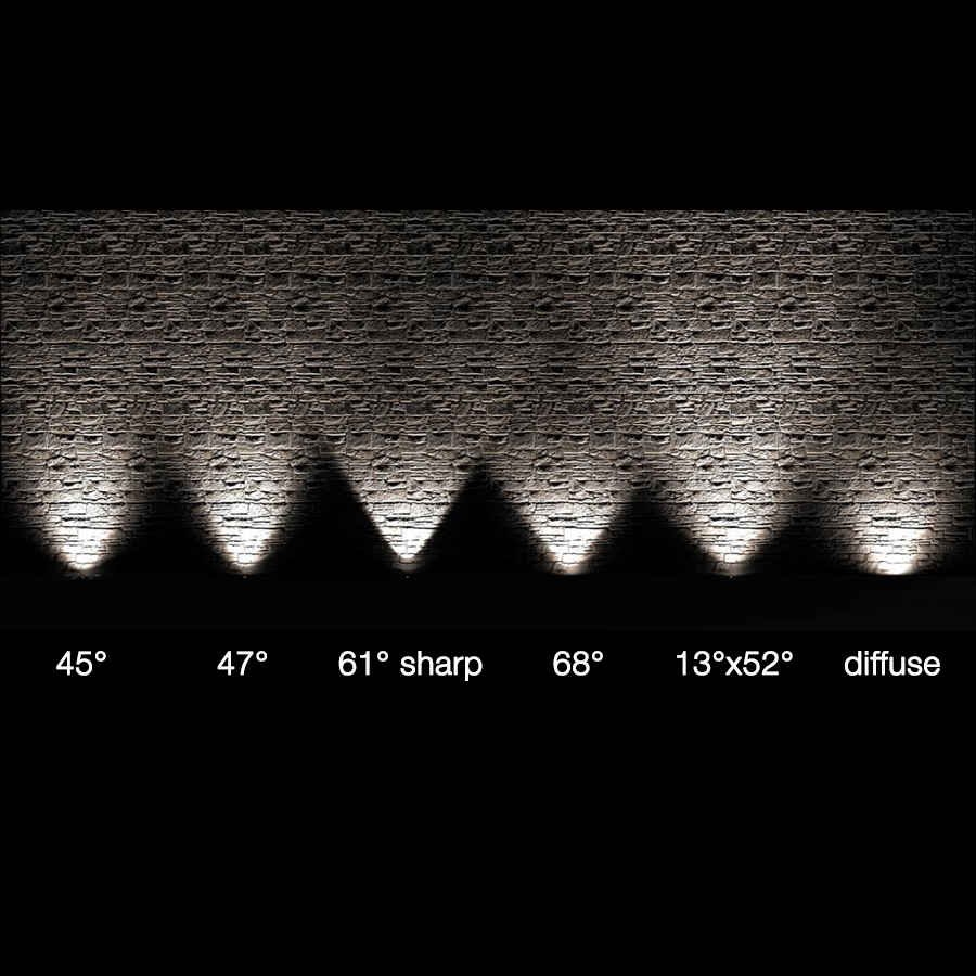
Precisely because we know how light varies as the texture changes, when we present a range of optics to the customer, we often show the effect of light on different substrates and renders:
🌳🌳🌳
Sometimes what distinguishes a facade are the shadows of a tree or trees –
we talk about that here
LA: Tones of light
So far, we’ve discussed how to enhance the architectural personality of a building by allowing its silhouette and distinctive features to be read even at night. We have done this with a classic white light in order to stay faithful to the original intentions of the architectural design.
But, if the aim is to generate emotion and communicate a message, we’re happy to reach for the colour palette.
An event location on the coast can certainly allow itself to use a bold blue colour to light the large arches overlooking the Mediterranean.

Neva 5.1, RGB, 30W, 15° Go to the project and credits
RGB / RGBW fixtures give you the freedom to adapt the lighting colour to the moment: perhaps white in the early evening and a vibrant tone at night, or lighting scenes that change according to a preset programme.
An adventurous use of colour is something we expect for hotel facades, event venues, companies and flagship stores. But over the years we have also used it on institutions and private homes.
You can’t keep colour in, you've got to let it out! 🎨💖

River Wall 5.0, RGBW, 60W, 33°, grey Go to the project and credits

Bright 5.H, RGBW, 20W, 20° Go to the project and credits
Coloured light can also be used temporarily, to celebrate anniversaries or mark a special occasion – a splash of colour in urban space is unlikely to go unnoticed :)
One trend we’ve seen in the last couple of years is the use of RGBW light to recreate a country’s national flag on the facades of state buildings. A versatile light that can be brought out on special occasions, while a standard white is used the rest of the year.

Neva 7.1, RGBW, 45W, 18° Go to the project and credits
TI: Extending the light
Tailoring light also involves considering the facade’s dimensions, especially the height – of the entire wall or individual architectural elements – because they directly influence the wattage and number of lighting fixtures needed to achieve the desired effect.
We receive many queries about the correct wattage for a given height.
Unfortunately, there’s no single answer: many factors contribute to the decision. First of these are the fixture’s own characteristics, such as the optics and the delivered lumen output but, for a complete answer, we also need to consider the materials illuminated and what other lighting sources, if any, there are in the vicinity.
However, we’ve created a general table for outdoor uplights, based on the fixtures’ dimensions and wattages, so that we can answer with some broad indications (which then need to be refined by combining the other elements mentioned above into the lighting design).
🔶 walls up to 2 m: diameters from 30 to 50 mm and power 2W / 3W
🔶 walls up to 4 m: diameters from 70 to 80 mm and power 3W / 7W
🔶 walls up to 7 m: diameters from 85 to 100 mm and power 10W / 13W
🔶 walls up to 10 m: diameters from 140 to 200 mm and power 14W / 20W

recessed for outdoor applications
🎵 Each of our families of outdoor fixtures includes versions with different dimensions and wattages, so that a mixture of fixtures from the same family can be used, safe in the knowledgethat they will produce a uniform aesthetic on the building’s exterior.
🎵 We can equate unison – the effect of two or more sounds of equal pitch, heard simultaneously – with the uniform lighting effect of different fixture types. The photo below shows different types of device, an uplight, a projector and a wall-mounted fixture, that all share the same optics, and light intensity and height.

Bright 2.4, 4000K, 7W, 8°, trim in stainless steel / Smoothy 2.4, 4000K, 7W, 8° / Litus 2.4, 4000K, 7W, 8°

Intono 2.2, 3000K, 12W, 11°+11°, anthracite / Ginko 2.0, 3000K, 5W, 11°, anthracite / Smoothy 2.4, 3000K, 5W, 11°
Dissonance
This is the inharmonious, discordant, unpleasant effect that we all want to avoid. Its equivalent here is the undesirable effect of glare, and light pollution in general.
These effects can be anticipated at the design stage, and we advise directing the light output very precisely, so that it remains within the surface to be lit and does not continue beyond the cornice. To make sure of this, sometimes it is enough to choose a tiltable recessed fixture over one with fixed optics, or a projector over a recessed fixture. The latter could be positioned at a distance from the wall, as we suggested in our article on lighting the exteriors of places of worship.
At other times, a grazing light travelling down the wall is the ideal solution for reducing light spill – for example, using linear profiles mounted on brackets with accessories such as a honeycomb louvre and anti-glare shield to avoid glare.
We know what a big role light plays in adding expression to architecture, whether urban or residential, and we believe that the right balance can be found between light and dark when lighting is used responsibly. In fact, in recent years, we have supported the spread of a lighting culture aimed at preventing light pollution, and we’ve developed solutions to combat this phenomenon effectively.

Let’s take the example of the latest addition to the L&L Luce&Light family: Tago, a drive-over LED linear profile. Tago brings with it all the culture of responsible light use we share: deep-set optics to guarantee visual comfort, tiltable by ±20°; wall-washer and wall-grazing optics so the light output can be precisely oriented and light spill avoided; dimming light control, to have light only when and where it is really needed; anti-glare accessories built into the optical unit; and, last but not least, a warm 2200K light in consideration of the non-visual effects on people and wildlife. The wellbeing of people and the environment also depends on the right facade lighting.

The light direction can be altered by ± 20° externally with a simple adjustment on the end caps. Optical accessories of honeycomb louvre and anti-glare shield built into the lighting fixture and tiltable together with the optics Find out more about the product
In the case of historic facades, the scope for intervention may be limited by the need to comply with the requirements of the authorities responsible for cultural property. In most cases, the issue is the perforations required to install the lighting fixtures. These can be reduced to a minimum by using small, light-weight projectors and looking for a hidden route for the cables to run between the architectural elements.
The ability to paint the fixtures in a specific colour tone means they can blend into the facade or the structure, ensuring that the appearance of the building is unchanged in daylight. Another way to reduce the visual impact of a fixture is to use an anti-glare shield, an accessory applied externally to the fixture, which can be painted in the same colour as the wall on request.
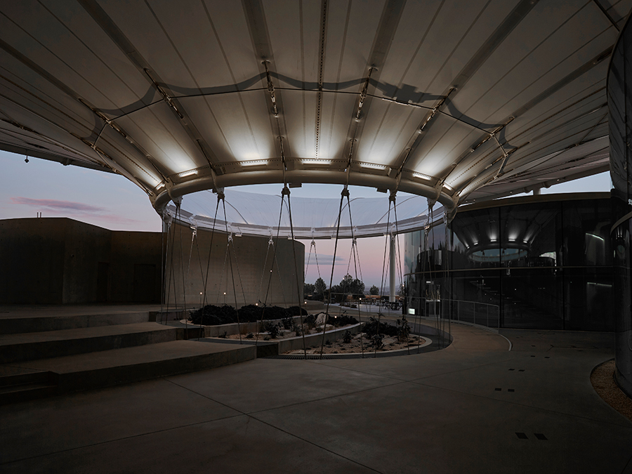
Neva Mini 1, 3000K, 13W, 45°, with brackets, with white anti-glare shield Go to the project and credits
We have placed the seven notes of facade lighting on the musical score, concentrating on the construction of different depth levels, the use of light to create rhythm, the effects of different materials, different heights, and the architectural elements that define it.
We’ll leave it to you now to arrange the melody and concentrate on the orchestration you want – when you’re ready, you can count on us to supply the instruments ;)
Have you designed a facade using our fixtures?
What are you waiting for? We want it for our reference book!

