| Location | Leudelange, Luxembourg |
|---|---|
| Project | Architecture & Urbanisme 21 Yvore Schiltz et Associés / Parallel architecture intérieur / Agence Christophe Gontrand & Associés |
| Light planning | Distylight |
The new headquarters of the Foyer insurance company in Leudelange, Luxembourg, has been the subject of a concerted, synergistic operation overseen by the Architecture & Urbanisme 21 Yvore Schiltz et Associés, Parallel architecture intérieur, and Agence Christophe Gontrand & Associés architectural practices, together with the Distylight lighting design studio.
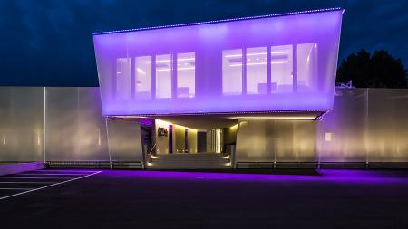
The building complex, which houses the headquarters of Luxembourg’s most important insurance group, underwent work to expand and join the structure’s two wings with a central linking body. This produced new reception areas for visitors and meeting points for staff, with the function of representing the brand's identity and values.
The lighting project designed by Distylight, which covers the new entrance and office wing, followed the evolution of the architectural project and has created different sequences of interpretation and a spatial hierarchy: the lighting intensity increases progressively from the entrance to the patio, guiding the visitor towards the building’s heart. The colour temperature also changes from one area to another as they follow on from each other, from the portico through to the central part of the edifice, which helps to mark out a symbolic route for the general public.
In the area in front of the building, Spot 1.0 projectors, with honeycomb louvre and asymmetrical snoot, were set between the shrubs to discreetly light the dense vertical vegetation with a colour temperature of 4000K (2W, 40°). Beneath the high, porticoed roof, which supports an iconic white facade, square Goccia 2.7 recessed fixtures have been installed, with a slightly warmer colour temperature (2W, 3500K, diffuse optics). The Goccia 2.7 fixtures are dotted around the paving almost as if deconstructing on the ground, in small pixels, the facade with its vertical elements. Once visitors have crossed the entrance, they arrive in the reception area, where the request was for warm, indirect lighting. Lighting for this green island has a cooler colour temperature, in order to highlight its features in contrast to the surrounding area. In this oasis for the eyes, Bright 1.6 (2W, 4000K, diffuse optics) products were chosen. Recessed into the ground and hidden by the gravel, they illuminate the vegetation with small, discreet points of light, highlighting the textures and colours of the plants and shrubs.
The Distylight lighting designer’s choice of such intelligent and emotional lighting has enabled the steel and cement to be shaped into fluid shadows and artistic chiaroscuros, underlining even the smallest details.

Sliema, Malta

Bergamo, Italy