The soundtrack to 2020 has been our doorbell rung by the express courier with a parcel for us.
Shut away inside our homes, some of us have dismantled and reassembled furniture, others have become expert bakers, and many of us have given vent to our needs and wishes by clicking “add to cart” and “proceed to checkout”.
But it goes without saying that the feeling of entering a real store, the so-called shopping experience, is something completely different.
Being able to touch a product, feel its texture between our fingers and its weight in our hands, gives us confidence and a soupçon of undeniable satisfaction, as Carrie Bradshop – sorry, I mean Bradshaw – teaches us.
E-commerce v brick-and-mortar businesses is not a match that’s fought to the sound of sales statistics. The moments we spend inside a shop give us an experience that is far deeper than a simple click – and it is only now that it’s missing from our lives that we realise how important it is.
This has led us to reflect on the role of lighting in these settings, how it can represent one of the drivers in the customer experience, how it levers memories and contributes to the objective of sales conversion.
Putting a brand in the best light
Let’s start with the main necessity for any company – communicating their brand.
🔶 The first step is to understand what its USP is: what is the advantage or benefit the customer can aspire to by buying the product (or service)?
🔶 The second is to understand which elements inside the shop can convey the brand identity.
The answers to these questions give us the points we need to focus attention on in the shop. This why the lighting designer needs to work closely with the marketing director to familiarise themselves with the brand philosophy so they can enhance it.
we know that lighting a place doesn’t mean flooding it with light.
Far from saying “shops are lit with this product” – not least because every situation is different and, in theory, there are an infinite number of solutions – we will relate how a lighting solution fits into the hierarchical spatial concept.
If the brand values include process sustainability, natural fibres, a short supply chain and being plastic free, and bales of hay are the enticement for customers to enter your store, we will probably lean towards a soft, warm light that aims to arouse feelings of wellbeing and being welcome.
Conversely, if the brand offering is a high-end product, this should probably be expressed through a more theatrical setting, in which more technical lighting works to highlight the materials or technology of the product-protagonist, and the lights put it on a metaphorical pedestal.
without leaving the latter in the dark!
Much as we love a touch of theatricality, let’s leave the spotlights in the actual theatres :)
We’ve got used to the rarefied atmosphere of Apple stores: ethereal and white, with bright, shadow-free lighting ... giving the idea that nothing is hidden and that everything is easy and at our fingertips.
A showroom for motorcyclists, on the other hand, will make a feature of dark tones (fifty shades of tarmac, anyone?), to reach the hearts of even the toughest characters, perhaps using lighting in a neutral colour temperature (4000K) to shape the light and shade, as in the project below.

Snack 2.3, 4000K, 22W, 10°, anodized grey Go to the project and credits
Once the brand and product (or service) values have been clarified, it will be easier to understand how to highlight the element of enticement.
We like to think that lighting is one of the languages of emotions. And it is emotions, stimulated by the illuminated elements, that galvanise customers and entice them to enter the shop – transforming a mere passer-by into a potential customer simply by getting them over the threshold.
Follow the light
A shop is a very complex environment, in which customer areas, such as the reception area, paths/walkways, changing rooms and checkouts, sit side by side with the areas dedicated to product display in all its forms: showcases, counters, shelves and niches.
These often all coexist in just a few square metres.
Lighting can help us not only to characterise each of these zones but also to create utilisation hierarchies able to direct a customer’s eye and lead them around the environment in a spontaneous manner, stimulated by a curiosity for discovery.
Let’s imagine the customer’s ideal path inside the store. Allowing them to discover the different zones one after another will keep them in store longer and contribute to their shopping experience.
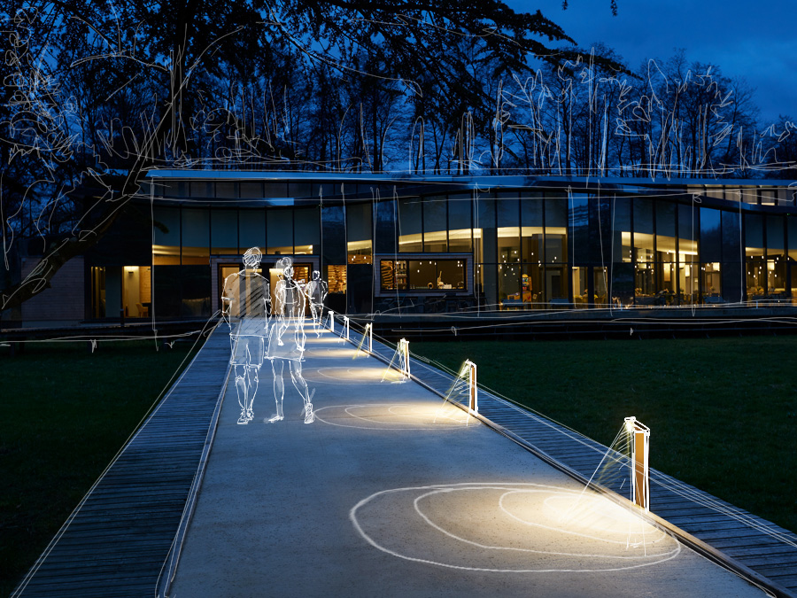
👣If the interior is very small, one idea is to draw the customer towards a back wall, where there will be staff ready to greet them. One way to do this would be to guide their feet with guidance lights in the floor, small, low-power (1W), diffuse-light recessed fixtures.

Snack 1.0, 3000K, 9W, 10°x45°, anodized grey Go to the project and credits

Simply 1.0, 3000K, 1W, pearl chrome
To increase the impression of depth to the space from the first glance in the doorway, we suggest you give preference to lighting vertical surfaces (better if from below) rather than horizontal ones.

Medium optics on shelving (horizontal) 
Diffuse light + uplights on walls (vertical) --> helps to suggest a larger space
Video screens and LED walls can also be included in the vertical illuminated surfaces inside the store, and we know how much their activity often overlaps with lighting. It is therefore advisable to make sure you know where they are going to be placed from the very outset of the project.

Neva 5.2, RGB, 50W, 15°, with brackets Go to the project and credits

Snack 2.3, 4000K, 22W, 10°, anodized grey Go to the project and credits
Versatile displays
We have all learnt about shop dynamics from our Saturday afternoons spent window shopping in city centres: we know it is good practice for shopkeepers to move the merchandise around from week to week to create a feeling of freshness for the customer.
Whether products really change or not, the people in charge of the store visuals need to be able to rely on extremely versatile lighting so they can rapidly reconfigure the space.
Preferably without eating into the budget.

Siri Track 2.0, 3000K, 16W, 29°, black Find out more about the product

Siri Track 2.0, 3000K, 16W, 29°, black Find out more about the product
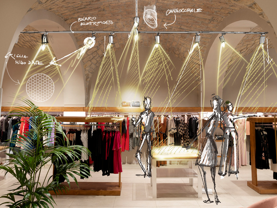
It is precisely in facilitating adjustments to the lighting design that track systems come into their own.
The ability to reposition a projector – moving it closer to a product to be foregrounded or across to a new display unit – has been the key to giving staff autonomy in rearranging the lighting, in a boutique for example, without the need to involve an electrician for every little set-up change.
To make things even easier for shop staff, we have created a variety of projectors that allow them to alter the light output or vary the brightness using a simple built-in dimmer.
After all, moving and redirecting the fixture is not always enough: when the objects on display change, the light they are in will have to adapt to the changes.
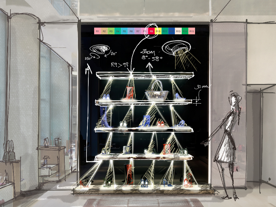
If a clutch bag is replaced by a beach bag, for instance, the aperture of the light emission will need to be widened.
There are a number of ways to change things up without replacing the entire lighting fixture. Here are two for you to consider:
🔶 interchangeable filters that shape the output – as you can see in the video below, which shows the simple and practical change from narrow to elliptical optics
🔶 using projectors with a manual zoom lens – the optical unit can be adjusted as if it were a camera lens, to alter the width of the light output with a very well-defined effect.
Let's take the case of a specific shop, an art gallery with projectors installed whose zooms are adjusted according to the painting on display.

Zab Track 2.0, 3000K, 23W, white, APART spaziocritico, Vicenza, Italy, courtesy of Sharon Di Carlo Find out more about the product
Track systems certainly win on versatility, not least because they allow you to run the power supply practically anywhere, but you could hardly say they are good at blending in, particularly when the track is not recessed but fixed to the surface of the ceiling.
Where a plasterboard false ceiling is available, we might prefer a more discreet solution, such as recessed downlights.
Are we worried this could prove to be too restrictive a solution? There are some extremely versatile recessed solutions designed specifically for retail and showroom settings.
The hidden source
We need to keep an eye on our eyes! We want to see the light without being troubled by its source, that is the point in the lighting fixture it is emitted from. We must avoid catching that with our eye if we are to avoid being dazzled.
There are three things you can do to ensure visual comfort:
👉 use fixtures with deep-set optics, where the LED is set further back with respect to the cover,
👉 consider the use of anti-glare accessories such as a honeycomb louvre and, on projectors, snoots and barn doors (a bit vintage, but still very current),
👉 pay particular attention to how the fixtures are directed, making sure you take into account the position of the customer approaching the product.
We want our customers to be blinded by the beauty of that décolleté with the 12-cm heel ... and not by a light source!
In this article we’ve talked about the general approach to the shop space and customer areas, and about the practical solutions offered by lighting fixtures.
In the next one, we’ll address display details and colour rendering.
Have you used L&L fixtures to light a shop?


