We look at building facades as if each one were a musical score: what are the notes that resonate most? What are the basic chords in a lighting composition for an external architectural structure?
DO: Symphony of light
It is almost night in the Norwegian city of Bergen, and the lights on the old stock exchange are coming on. Let’s imagine we are among the pedestrians crossing the square, looking up at the facade.

Neva 1.0, 3000K, 25W, 10°x40° / Neva Mini 1.0, 3000K, 9W, 10°x40° / Spot 1.0, 3000K, 2W, 20° / Trevi 1.0, 3000K, 6W, diffuse optics, 313 mm version Go to the project and credits
First of all, we can see that the building’s facade is not uniformly lit: the light is used differently depending on the planes and architectural elements on which it rests.
The four pilasters stand out clearly, elegantly structural.
The volumes to the sides are in shadow: the lighting plays (down) the background.
The centre of the building is foregrounded: the main entrance, the tympanum and the arched window in a modern entablature.
The light links these main elements together, and enhances the red of the bricks, the two small pillars on the ground floor and the three round arches above. We notice that the central connecting elements are the same as those on the sides, and we can see how their visual weight changes.
The two cornices run horizontally, and the taller, more imposing one has a visual function of containment and limitation.
The facade has taken on depth with this interplay of light, shadow, and all the nuances in between. It
RE: Arranging the depth levels
Observing the facade of the previous paragraph gives us an initial approach to lighting the architectural skin of a building.
It is useful to understand what and how many structural levels there are, so they can be organized into a hierarchy of foregrounds, backgrounds and intermediate levels.
Let us now consider how light allows us to bring out these depth levels.
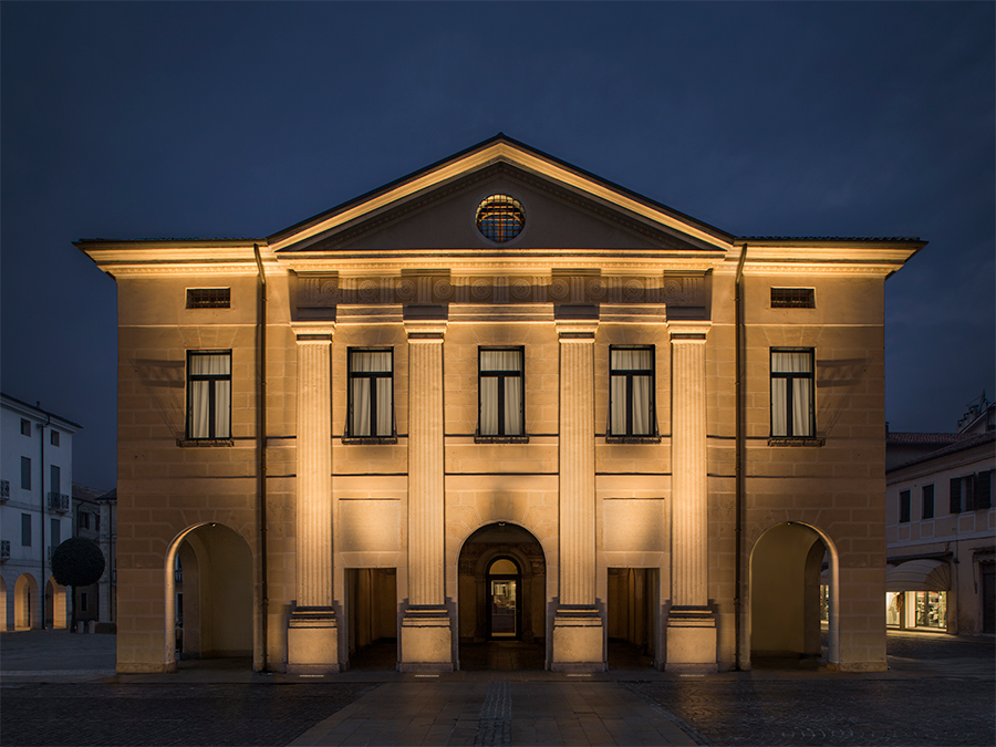
We took as our ‘guinea pig’ a building in the centre of Cittadella, and we had fun trying out different lighting arrangements, to see for ourselves how the perception of the architecture changes.
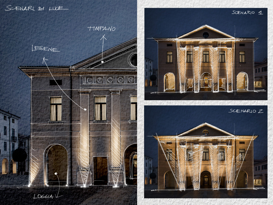
🎵 The architectural elements identified were the four pilasters, the three arches on the ground floor, the portico, the cornice, the tympanum and the round window at its centre.
🎵 Most of these elements are in the foreground; the arches, the portico and the interior of the tympanum are one step back.
🎵 The projecting elements are the cornice and the capitals of the pilasters.
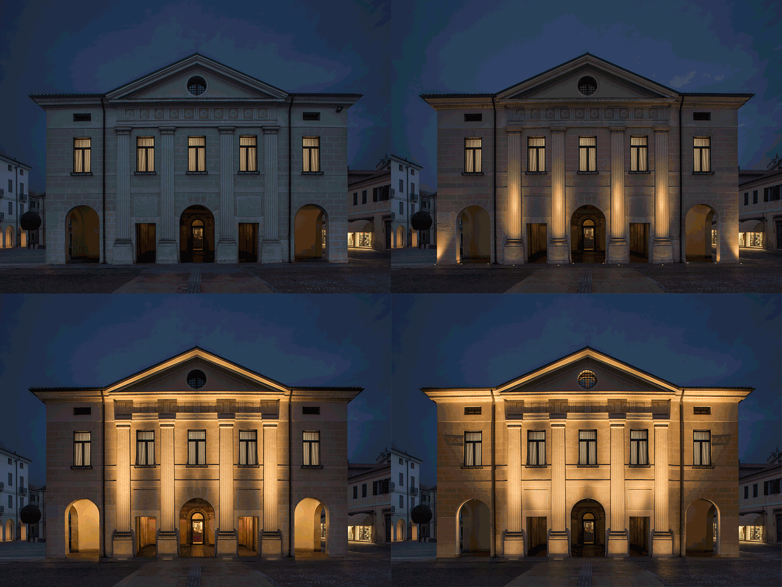
In the first scenario, below, we added minimal lighting using 10W recessed uplights with wide optics on the two external corners, recessed uplights with diffuse optics in the internal thicknesses of the arches, and uplights with very narrow adjustable optics directed at the capitals.
This lighting solution only acts on the building’s lower register, and the accents it creates do not produce an effective connection between the different depths.

Litus 5.4, 3000K, 10W, 40° - diffuse optics / Litus 5.6, 3000K, 8° tiltable ±15° Find out more about the product
In the second scenario, we chose to work on two levels of depth: the central elevation is highlighted along its entire length because the light extends from the base to the cornice of the tympanum while, on the sides, we wanted to work exclusively on the background elements, so picked out the porticoes with indirect light.
In addition to changing the layout, we used a different type of fixture than in the first scenario: 20W linear profiles with 11° optics, recessed at the foot of the pilasters.
Compared to the previous lighting scenario, this one is more respectful of the building’s volume. The two side arches, through which the indirect light of the portico filters, create a visual balance in the proportions of light and shade. All the same, we’re still not satisfied: deprived of its ‘wings’, the central section appears incomplete, just as the cornice, which continues along the lower edge of the pediment, appears interrupted.

River 1.0, 3000K, 20W, 11° Find out more about the product
Let’s mix things up a little.
In the third scenario, the linear profiles at the feet of the pilasters have elliptical optics this time, whose beams open towards the sides of the building, reaching the ends of the cornice. The entirety of the projecting elements is enhanced, which is the effect we were looking for.
As for the backgrounded building elements, we’ve chosen to forego the indirect light from the portico in favour of accent lighting on the internal thicknesses of the two side arches, areas that would otherwise have been abandoned to darkness. A similar touch of light picks out the internal profile of the round window in the centre of the tympanum, sounding a similar note.
River 1.0, 3000K, 20W, 10°x40° / Lyss 1.0, 3000K, 7W, satin 20°x180°, anthracite
MI: The rhythm of the architectural elements
👉 Modus operandi 1: recognise the rhythm that architectural elements give to the facade and accentuate it with lighting.
This time, we turn to a more contemporary structure – the next case study takes us to Porto.
The most striking element of this facade is the square recesses that frame the large windows. To accentuate these, the lighting design studio elected to place the lighting fixtures in the corners of the windowsills, so that, as the light reaches the opposite side of the frame, it follows the gradations of its volume that gradually level with the plane of the facade.
The architectural design, made up of solids and voids, is enhanced by the lighting, which, directed solely at the windowsills and their large windows, dictates a rhythmic pattern that gives tempo to our gaze.

Lyss Mini 1.0, 2700K, 3W, satin 9°x160°, cor-ten, base for corners / Beam 1.0, 2700K, 3W, 8°, stainless steel / Rio 2, 2600K - 2800K, 19W/m Go to the project and credits
A short digression: in particularly minimalist contemporary buildings, windows are often the only distinguishing architectural element on the facade or are the only element the designer wishes to enhance (by lighting the negative space).
Returning to identifying the element to be emphasised, we come to the case study on the facade of the headquarters of Jakob Rope Systems, a globally renowned manufacturer of metal ropes and frames.
The architecture foregrounds the flagship product in the facade, in a process that establishes both aesthetics and the company’s core business. The Swiss lighting design studio Sommerlatte & Sommerlatte decided to exploit the light blade of the Lyss 1.0 projector to obtain a grazing effect on the steel tie rods.

Lyss 1.0, 3000K, 7W, clear 10°x180°, anthracite, with customized bracket Go to the project and credits

Lyss 1.0, 3000K, 7W, clear 10°x180°, anthracite, with customized bracket Go to the project and credits
👉 Modus operandi 2: establish the rhythm of the facade through the lighting, while respecting the architectural elements.
Let’s look at two projects where the rhythmic insertion of lighting fixtures has contributed to the building’s distinctive look.
The Salvatore Ferragamo flagship store in Tokyo has diffuse-light linear profiles in different lengths running along its facade, creating a visual continuum between the two blocks that make up the building.
The Radisson Blu Hotel in Niamey has 113 compact projectors scattered along its entire height, their accent effects creating dynamism.
One type of fixture that lends itself to this quest for rhythm on a facade is the single- or double-beam outdoor wall-mounted device. It can follow the verticality of the structural lines or the intervals between other elements with narrow cones of light.
This solution also energises the visual perception of buildings.
🎵🎵
What if the rhythm on the outside of a building were not only metaphorical? With the Intono wall-mounted fixture, you can have a single beam of light directed upwards and a speaker mounted in the lower half of the housing to delight the guests on the terrace of a bar or restaurant with your playlists.
More about Intono | Voice-responsive light and sound, in tune with its surroundings
Our hymn to facade lighting continues: we’ll see you again in two weeks’ time with the next four notes!

