In the second part of our shopping tour, we’re focusing on display details and the colour values of light.
The customer's perception of a product’s quality is influenced by its context. And, in turn, the context and location are impacted by the light.
The lighting inside a shop can help to trigger that emotional response that the marketing team are looking for. This is the experience the customer will take away with them, even if they go home empty handed: a connection with the brand that could be expressed as an online conversion the next day.
You need the right lighting fixture inside a small display case
Let’s now turn our attention from the lighting for the general setting to the details of the display, focusing on the lighting for niches and showcases, the backdrops for small objects of desire.

Esem Mid 1.0, 3000K, 3W, 30°, white, Ottica Bergomi, Milan, Italy
Find out more about the product

Esem Mid 1.1, 3000K, 3W, 30°, anodized grey, Due di Due, Milan, Italy Find out more about the product
Let’s imagine you’ve entered a concept store selling coffee and chocolate delicacies.
Here, the fragrance of cocoa and the coffee bean aromas go hand in hand with accent lighting on exclusive little confections that require the spots to be positioned very close to them. By the way, if it weren’t for LED light sources, these dainty treats would be literally meltingly irresistible in no time at all :)
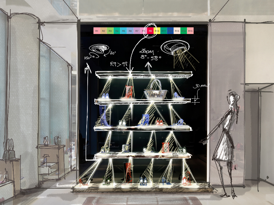
For accent lighting inside these small showcases or niches, the sales assistants can count on recessed fixtures and projectors that are extremely versatile and high performance despite being ultra-compact.
In the small-scale world of showcases, precision pointing is essential, and it can be achieved with:
🟧 installation accessories. Thanks to a choice of arms, bases and ceiling roses, the projector can get to anywhere inside a display cabinet
🟠 adjustability. The ability to rotate the body of a projector through a substantial arc is fundamental, and the same holds true for a small recessed fixture
🔶 a zoom lens. To be able to alter the light emission with maximum flexibility.
If we think about the projectors in a jewellery display, we are probably most likely to picture them mounted on an arm or a leg. But there’s more to it than just arms or legs :D
🟧 Sometimes the installation accessory can make all the difference, providing us not only with the best installation solution, but also with the right aesthetic quality.
This is the case in the image below, for example: in the centre of the scene, you can see a black strip to which three tiny projectors appear to be fixed. In reality, they are not fixed down but rest on a magnetic base that allows them to be easily moved around the iron pole. Here, the lighting plays with a theatrical setting inspired by a Metaphysical Town Square by Giorgio De Chirico.
If the object on display were to be replaced at the last moment by a vase or a jewellery set, it would take no time at all to slide the projectors along the pole and point them at the new objects.

Krill 2.4, 3000K, 2.5W, optical range 9°—70°, rose gold, with magnetic plates on an iron pole Find out more about the product
🟠 As far as adjusting recessed fixtures on display case shelves is concerned, one solution could be a small recessed fixture that is adjustable and/or partially extractable.
Regardless of whether they are installed in the top, sides or bottom, these tiny LED projectors won't hold it against you if you use them upside down.

Ciak 2.7, 3000K, 17°, white Find out more about the product

Ciak 1.6, 3000K, 52°, black Find out more about the product
🔶 Finally, there’s the zoom lens, which allows you to alter the width of the light emission and adapt it to the requirements of the display case without removing the device from its setting:

Cameo 2.8, 3000K, tiltable zoom lens 8°—58°, white Find out more about the product
Red Passion High CRI
If we were asked to think of the colour red, some of us would think of Ferrari Red, others of the soles on a pair of Louboutins, and yet others of a good Barolo. There's no end to the possible shades of red: the important thing is that the red is precisely THAT red, and that its performance “in the spotlight” doesn't veer towards orange or burgundy.
the best light sources are deployed to achieve an excellent colour rendering.
While, in the past, the prime example of colour rendering was a bright red rib-eye steak that took on a much less inviting colour under domestic lighting, with our thoughts turning to Carrie Bradshaw, we prefer to demonstrate it with make-up 💋💋💋.

CRI 80

CRI 98
The fundamental concept hasn't changed – what has changed over time are the methods used to measure the colour rendering, that is to say the ability of a light source to faithfully reveal an object’s colours as only our beloved sun can (with its top score of 100!). These methods are:
🔶 the now well-established and ubiquitous CRI (Colour Rendering Index) value, ranging from 0 to 100 and obtained from an average of only eight sample colours
🔶 the more recent TM-30, which considers a full 99 sample colours to return a pair of values. These are the Colour Fidelity (Rf) – comparable to CRI – which ranges from 0 to 100, and the Colour Gamut (Rg). This measures saturation and can be higher or lower than 100, depending on the value indicated in the Rf index.
To be certain of achieving vivid colours, make sure that the lighting fixtures are fitted with LED sources with a CRI value greater than 90, TM-30 Colour Fidelity (Rf) greater than 90, and Colour Gamut (Rg) around 100.
As already mentioned, emission along the red wavelength is the LED’s weak point so, if the objects to be displayed have a red dominant, it is a good idea to check the CRI data for red (R9).

Zab Track 1.0 / 2.0 / 3.0 / 4.0, LED Xicato Xtm Artist Series®, Colour Rendering Index Find out more about the product
The show must go on – day and night
After a full day's work, it’s finally time to pull down the shutters. However, the shop and the brand’s hard work will continue into the night. When the shop assistants are no longer there to guide us through our shopping experience, it is up to the shop windows to take on that job.
The brand will want to be on show throughout the night, and this is why it is important to choose lighting fixtures that guarantee energy savings.
Furthermore, artificial lighting works non-stop the entire day in shops, unlike most other indoor settings. Adjusting the lighting for the nighttime hours is essential to safeguarding both the electricity bill and the environment.
The energy efficiency of LED sources means consumption can be reduced, even further if controlled with dimmers, without completely bringing the curtain down on the shop at closing time, allowing the brand to speak even at night.
🔶 Lighting shelves inside gives depth to the space (as well as discouraging unwelcome visits outside opening hours) and draws the attention of passers-by, who can explore with their eyes a little further in than just the foreground offered by the shop window. Something that could easily encourage them to come back the next day to try on that jumper or those winter boots.
🔶 The ability to have more discreet lighting in the evening and brighter lights during the day means you can address people with exactly the right tone of voice throughout the day, and throughout their experience.
After all, we started this tour inside the shop saying that for us light is one of the languages of emotions, and we come back to this once we have left the shop and are looking at the windows.
The shopping experience we’ve talked about is the sum of a mix of factors: together, we have looked at the lighting variables we can control to ensure that shoppers’ experiences are commercially effective, starting with the way light defines their perception of the space and ending with how it can enhance the details of the products on display.
Have we forgotten anything you think is important about lighting in retail?


